Identity.
Positioning, voice, and visual identity for Evalgist. Code sources from @evalgist/content-style and @evalgist/design-system.
Evidence, not verdicts.
The brand promise. Every external surface stays beneath this ceiling.
Three load-bearing clauses. Large volumes of structured documents: resumes, exam answers, proposals — not arbitrary conversation. Faster, more consistently, with evidence: three measurable promises. Substantiation, not conclusions: the product ceiling is set deliberately below "the AI decides."
Episodic evaluators.
Professionals who do evaluation work a few times a year, not as a main job. The first pilot is academic because the pain is sharpest there, but the product is not education-only.
Sober. Confident. Dry.
Short sentences. Reference voice: The Economist, not TechCrunch. English even in Belgian context. The brand does not joke about regulators.
Prefer
Avoid
Do say
Evalgist Shortlist surfaces the candidates who best match your criteria, each anchored to quotes from their resume.
Don't say
Supercharge your hiring with revolutionary AI-powered screening that seamlessly shortlists top talent.
Why: States the function, names the evidence. No superlatives, no startup enthusiasm.
Do say
The human remains the decider. The model supplies substantiation.
Don't say
Our AI makes smarter hiring decisions for you, so you don't have to.
Why: Evalgist never claims to decide. The product's value is that the human is accountable.
Do say
Every score is traceable to a literal passage. Review it before you accept it.
Don't say
Trust our AI — it's been trained on millions of documents.
Why: Authority comes from traceability, not scale.
Forbidden by default: emoji, exclamationMarks, superlatives, startupEnthusiasm, ironyTowardRegulators. On AI positioning: say "AI-assisted evaluation", not "Powered by AI". Name the function, not the marketing claim.
Evalgist is the brand. Products take suffixes.
Never sub-brands with independent identity. First mention uses the full name; second mention may shorten to the suffix.
Portfolio: Evalgist Shortlist · Evalgist Grade · Evalgist Review · Evalgist Interview · Evalgist Benchmark.
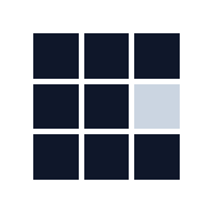
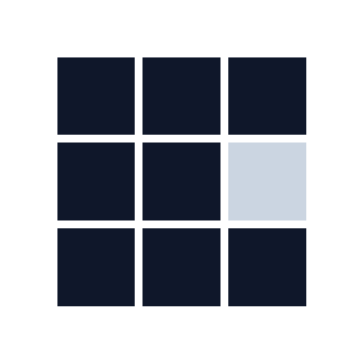
Eight cells of ink. One cell of tone.
No outline, no frame, no highlight. The absence is a quiet member of the field, not a UI state.
The sizes it will actually be seen at.
Above 24 px the tonal cell renders at slate-300. Below 24 px it lifts automatically to slate-400 so the cell stays legible.
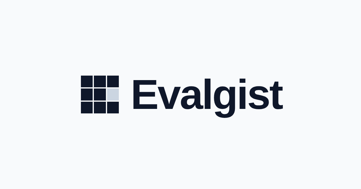
Mark, wordmark, and their agreed proportions.
Geist Sans 600. Primary wordmark ≈ 0.78× mark size; product suffix 10 px uppercase with 0.15em tracking, stacked beneath. Gap between mark and wordmark is optical.
Authoritative specification.
These values are the source of truth. Everything else is a derivation.
The component handles size- and surface-aware logic.
Never manually select between mark variants or hard-code lockup proportions. Import the primitive.
// Product UI — default size, inherits color
import { EvalgistMark } from "@evalgist/design-system/brand";

<EvalgistMark size={20} />

// Dark surface — sidebar, topbar, any inverted region
<EvalgistMark size={24} inverted />

// Full lockup — product pages, auth screens, hero
import { EvalgistLockup } from "@evalgist/design-system/brand";

<EvalgistLockup markSize={32} />

// Product header — Shortlist, Grade
import { EvalgistProductLockup } from "@evalgist/design-system/brand";

<EvalgistProductLockup product="Shortlist" markSize={32} />

// Tight context — nav, breadcrumb, dense header
import { EvalgistWordmark } from "@evalgist/design-system/brand";

<EvalgistWordmark size={15} />
// app/layout.tsx — wire the favicons
export const metadata = {
title: "Evalgist",
icons: {
icon: [
{ url: "/favicon.svg", type: "image/svg+xml" },
{ url: "/favicon-32.png", sizes: "32x32", type: "image/png" },
{ url: "/favicon-16.png", sizes: "16x16", type: "image/png" },
],
apple: "/apple-touch-icon.png",
},
manifest: "/site.webmanifest",
};
export const viewport = { themeColor: "#0f172a" };Constraints that protect the reading.
Rules first; then visual examples of violations.
Mark violations
One accent. Brand, never state.
Editorial Plum — oklch(0.39 0.105 325) · #602e63 · 10.1:1 on white. Selected 2026-07-07 after a two-round shootout gated on one test: it must never read as a fourth confidence band.
Where it may appear, by surface tier: brand — lockup-adjacent furniture, OG cards, press layouts, but never inside the mark. Marketing — eyebrow dots, links, article and blockquote rules, illustration highlights; at least one ownable anchor per primary page. Product chrome — links only. Buttons stay near-black, band pills keep their semantic hues, and the focus ring stays neutral.
Evidence Editorial. Evaluation made inspectable, not mysterious.
Illustration and generated imagery extend the design system — they do not start a second brand. Synthetic documents, evaluation grids, quote evidence, and slate composition. The full agent-readable contract lives in packages/design-system/IMAGE_STYLE.md.
The formula
Synthetic documents + evaluation grids + highlighted quote evidence + restrained product UI + slate editorial composition. Every image centers a source artifact. The human remains the decider; imagery shows the substantiation, never an AI verdict.
Synthetic composites
Built from owned shapes — no stock, no capturesHero composite: a document fragment, a criteria matrix banded by confidence, and a quote card. All data synthetic; bands carry the only color.
Spot diagram: source to human decision in four nodes.
OG card: one artifact, heading added in code — never generated. Rendered live from /api/og.
Image families
Synthetic documents, an evaluation matrix, quote cards, and bands as one product-led scene. Negative space holds the headline.
One large analytical artifact — criteria chart, band distribution, evidence trail — as the image for a guide or post.
A short flow: document, criterion, evidence quote, human decision. Used inline in body copy.
A restrained slice of real product UI, recomposed through Evalgist tokens with synthetic data.
One strong evidence artifact, 1200×630, with a short heading added in code — never generated.
Token-to-image mapping
Prompt anatomy
Copy-ready base clauseAdd a surface line per family (hero, publication, spot, OG) and the negative-prompt list. Full templates in IMAGE_STYLE.md.
Open Graph examples
Rendered at preview scale; generated at 1200 x 630Imagery contract
- Use the ambient grid as the recognisable field.
- Keep text regions protected and quiet.
- Show evidence paths, document surfaces, or product UI when the image needs substance.
- Avoid stock photography, decorative gradients, mascot illustration, and standalone logo cards.
Open Graph reference
- Canonical size
- 1200 x 630 px
- Runtime generator
- apps/www/app/api/og/route.tsx
- Metadata helper
- apps/www/lib/social-metadata.ts
- Production URL
- https://evalgist.ai/api/og?eyebrow=...&title=...&description=...
- Static fallback
- apps/www/public/og-image.png
Evalgist default card
grid, document stack, evidence card, human reviewEvalgist Shortlist
same artifact, product lockup plus its own headlineApproved, rejected
Mobbin references
Composition cues — cited, not bundledThese captures informed the direction. They are references only — never committed as Evalgist assets. Each notes what to borrow and what to leave behind.
Source files for non-React contexts.
In product code, always use the React components. These files are for slide decks, email signatures, partner decks, press.